- Client
- Halden
- Year
- 2026
- Disciplines
- Identity, Website
- Scope
- Brand strategy, Visual identity, Packaging, Website, Art direction
Overview
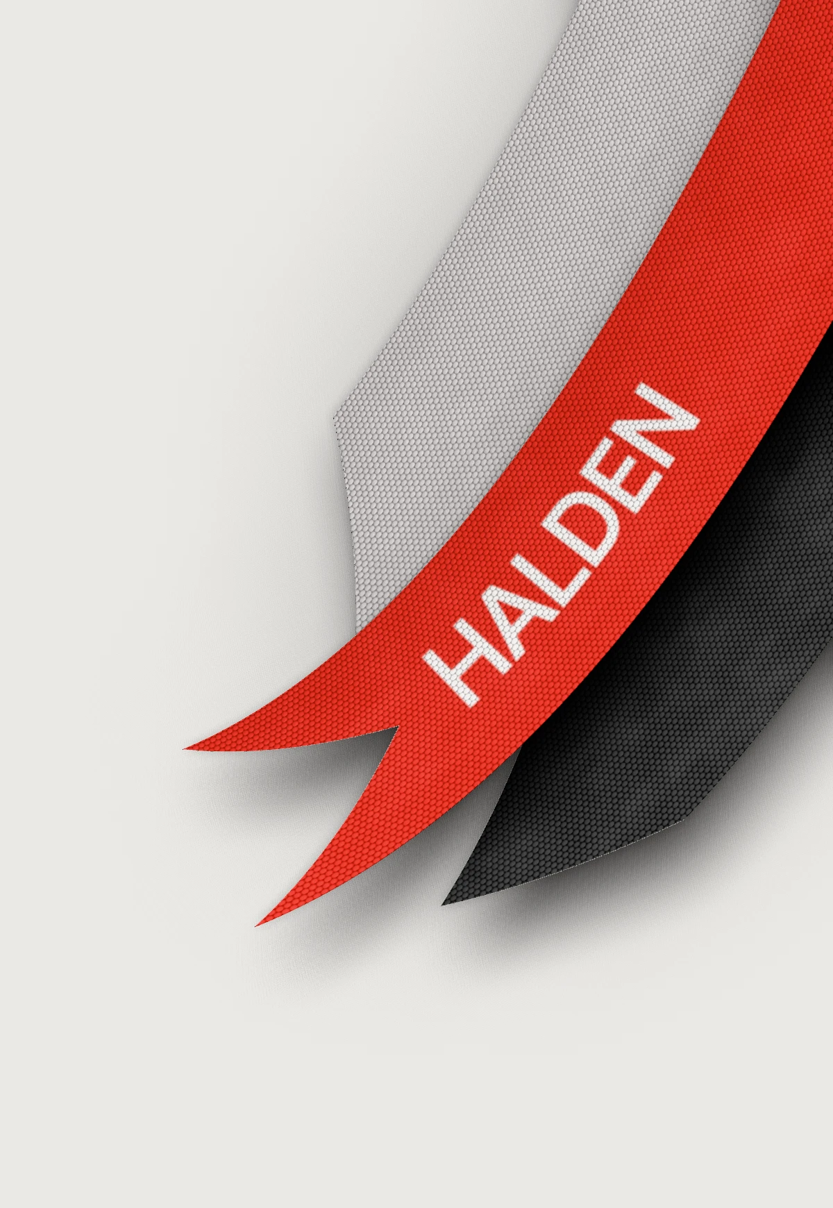
Halden makes kit for long days outside. We gave it an identity as hard-wearing as the gear: one red, one strap and a wordmark that holds up at any size.
The range had grown faster than the brand. Each product line had its own name, colours and type, and nothing tied a jacket to the bag beside it.
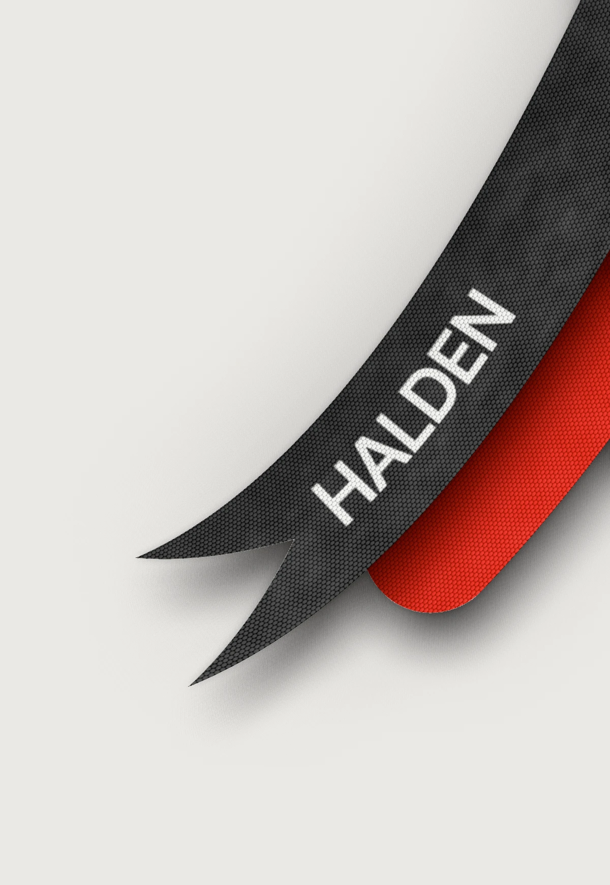
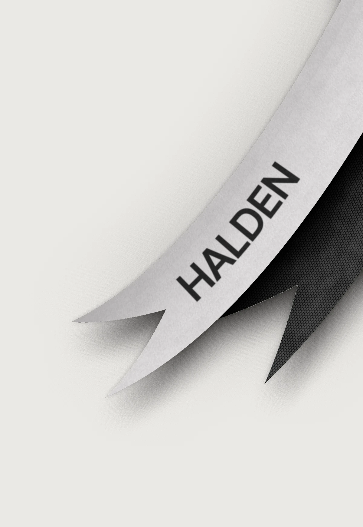
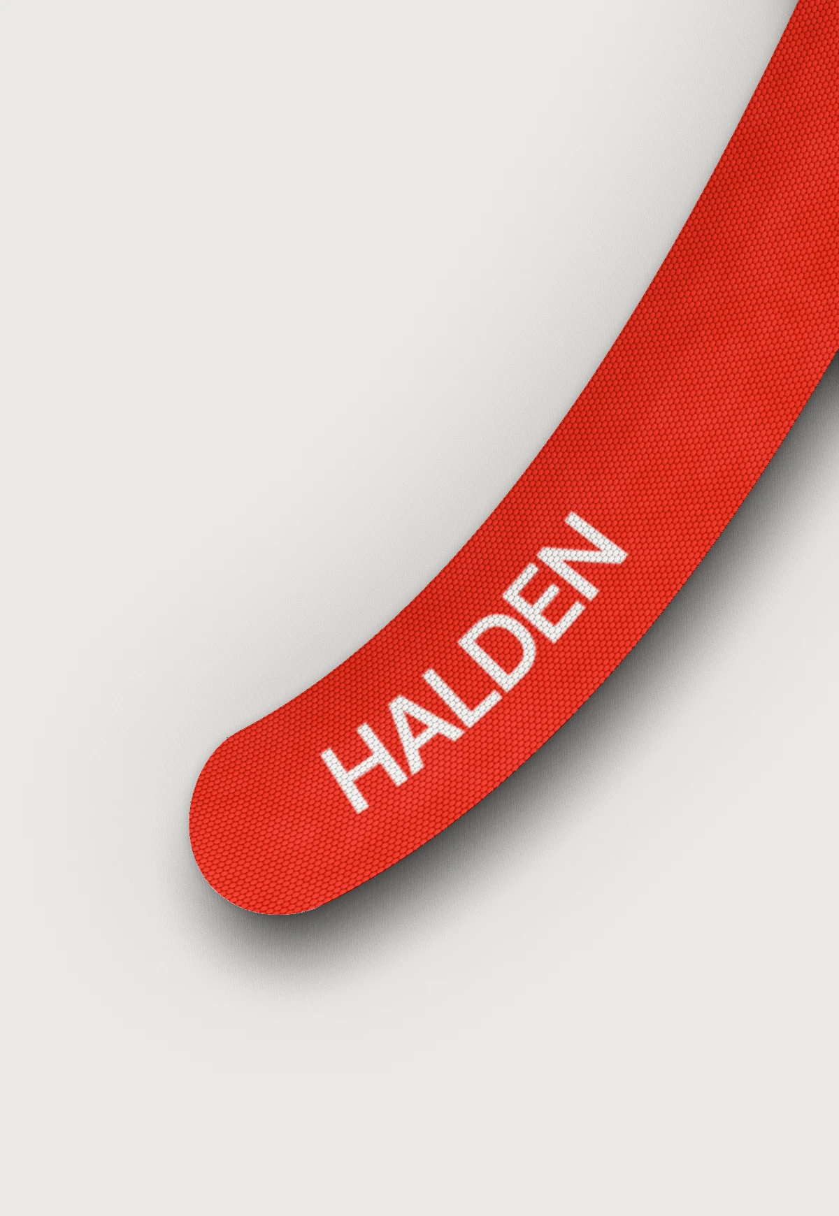
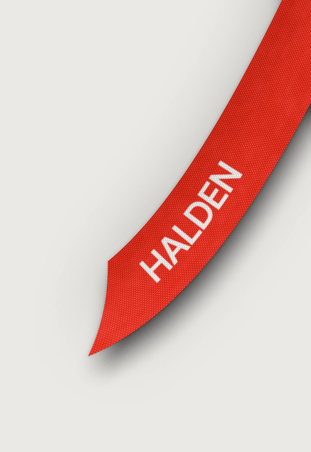
We started from the one thing every Halden product already shared, the webbing strap, and built the identity, the packaging and the website out from it.

Identity
A wordmark cut to be woven: heavy enough to survive on narrow webbing, open enough to read from across a shop.

Website
The site sells the range the way the shop does: one product at a time, up close, with the fabric doing the talking.

Credits
- Strategy
- Exovio
- Identity
- Exovio
- Website design
- Exovio
- Development
- Exovio
- Client team
- Halden
Next project

Contact
Building something you believe in? Tell us about it.